Every now and then, it’s fun to shake things up and decorate your house differently. However, when doing this, there are a few decorating mistakes that actually make your house look more cluttered than if you were to do something else. Here are just a few of those mistakes that you can avoid so your house looks nice and organized!
- Don’t mix up “clean” and “organize.” While, overall, this isn’t a huge problem, there can be times when this causes issues. For example, just because you neatly stacked all the piles of magazines on your coffee table, doesn’t mean that it looks good. Avoid clumping things together (even in an organized looking way), because it just looks like you didn’t have time to actually put them away.
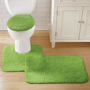
- Rugs in the bathroom are a great idea, but let’s not use those weirdly-shaped toilet rugs. You know, the ones that have the indent so they fit snugly around the base of the toilet. Yeah, not only do they have a weird shape, but they never seem to come in any flattering colors. Instead, get a nice and simple square rug that you can put in front of the toilet, not around it.
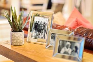
- Yes, it may be nice to have pictures of family on the end table, but you shouldn’t cover it in photos. Picture overload is a real thing and it makes any surface look crowded, messy, and cluttered. Choose your favorite pictures, hang some on the wall, put some on the end table, but then store away the rest.
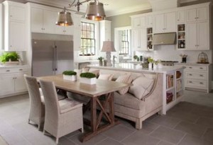
- The seating in your kitchen and dining room can be the difference between a fancy dining experience and an uncomfortable meal. First, make sure your chairs or stools have, at least, a common design (they can have different colored seats, but don’t have completely different styles). Also make sure the seating fits in the current style—old chairs may be cheap, but they’ll make your house look cluttered and outdated.
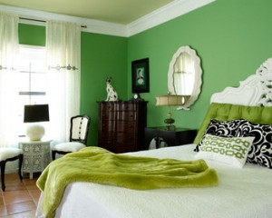
- Having rooms with different themes and color schemes is fine—but make sure one room isn’t a mixture of themes. For example, you don’t want a surfboard hanging from the ceiling to give a “surfer bro” feel and then have a polka dot dresser in the corner. Keep things consistent, that’s the rule when coming to a room’s theme.
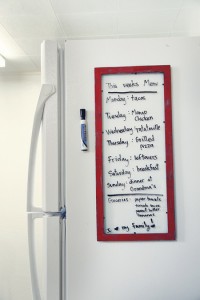
- While it may seem a classic American tradition to use the fridge as a message center—don’t. It just makes the kitchen look cluttered and messy. Not only that, but no one really ever reads those messages anyway. Keep the front of the fridge clear and, if necessary, put the messages somewhere else.
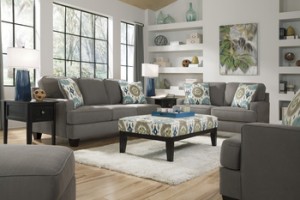
- Having furniture is a great way to make your home comfy and cozy, but if you overload a room or having mismatching furniture, it can just look messy. There’s not necessarily a limit to how many pieces of furniture a room should have (it depends on the size and purpose of the room), but make sure there’s walking room and that the furniture isn’t all different patterns, colors, and designs.
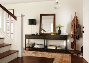
- Your entryway is the first part of your house that everyone is going to see, so make sure it’s clean and organized. Don’t just have an overstuffed coat hanger and some hooks on the wall. Devote some time and money into buying (or building) cubbies, shoe racks, and hangers so that everything has its place right when you walk into the house. Mirrors in the entryway can also make it look bigger and brighter, but don’t overdo it.
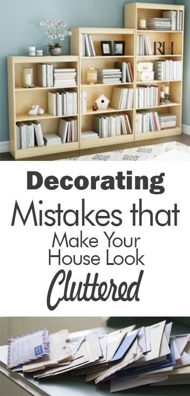
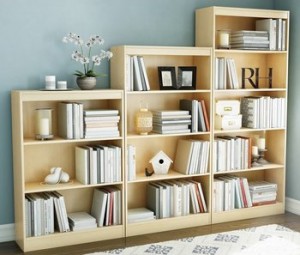
- Bookshelves are a great way to organize and add some character to a room, but be careful in not overloading them. Don’t put books, pictures, bookends, knickknacks, souvenirs, etc. on every single shelf. Instead, use empty space wisely to give the bookshelf a sophisticated but clean look.
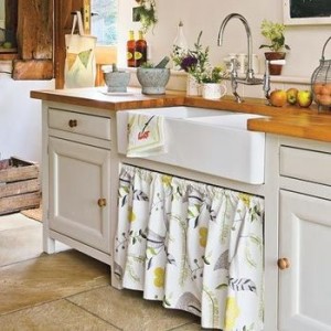
- One of the biggest causes of clutter is because items aren’t stored out of sight. Don’t just stick the vacuum behind the couch and think that’s good enough. Find room in closets, pantries, and storage spaces to put things away when not being used. A simple curtain around the sink or in front of shelving can really help cut down on clutter.


I always get a laugh out of remarks that warn me not to use dated styles or accessories. Meanwhile the picture is loaded with things that will be totally out of date very shortly. I much prefer rooms that look real and reflect a family, as opposed to those that are virtually identical to 1000 other pictures on Pinterest.
well, thanks for the link back anyway :). I haven’t used this message board in a while (it got lost in a move), but when I did I kept it on the side of the fridge to help with the whole clutter thing. I liked the way it looked and I used it daily for preschool with my kids, but you’re right. It’s easy for the fridge to get crazy!